

- Published on
Understand how styled-components works by creating a clone
styled-components is a CSS-in-JS library that uses the tagged template syntax in JavaScript and allows you to write actual CSS inside your React components as opposed to the object syntax. If you haven't used styled-components before, the below example from the official documentation should give you a brief idea about what styled-component is:
const Title = styled.h1`
  font-size: 1.5em;
  text-align: center;
  color: palevioletred;
`
Why is styled-components important
styled-components does a lot more than just enabling you to write CSS inside your React components. Here are some other advantages:
- Automatic Vendor Prefixing: Since some CSS features need to be prefixed for different vendors like
-mozor-webkit, styled components handles this for you automatically, so you write styles without having to worry about browser compatibility - Duplicate class names: In large projects, you may run into clashing class names. styled components prevents this by assigning random hashes as part of your class names. So your class names remain readable yet random and prevent clashes at the same time
- Simplified dynamic styling: The styled-components syntax makes it easier to apply dynamic styles without having to change the class name of components using JavaScript.
There's a lot more that I skipped for brevity's sake. Read more here.
Haven't used styled-components before?
styled components also allow you to pass the same props as you would pass to normal HTML tags.
const Title = styled.h1`
font-size: 1.5em;
text-align: center;
color: palevioletred;
`
const Wrapper = styled.section`
padding: 4em;
background: papayawhip;
`
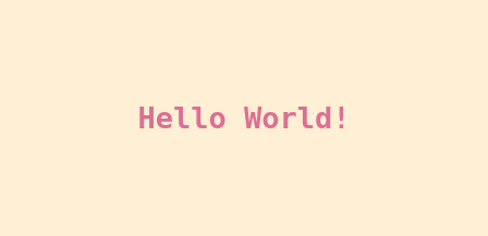
render(
<Wrapper>
<Title>Hello World!</Title>
</Wrapper>
)
The above code renders the following
The tagged template syntax
Tagged templates may look weird at first but it is valid JavaScript syntax. I won't go into a lot of details here but you can read more about it at MDN
Setting up the development environment
I am going to be using CodeSandbox as my development environment. If you want to publish your library to npm, I'll suggest using method 2 to generate a React library
Method 1
Using codesandbox.io React template
Method 2
Using create-react-library to scaffold a React component library.
First, create a new JavaScript project with
npx create-react-library stylish
then CD into the folder
cd stylish
To start the dev servers, open two terminals and use the following commands:
Terminal 1
npm start
Terminal 2
cd example
npm start
The first terminal compiles your JavaScript component. The second terminal starts a Create React App project dev server, which allows you to use the component in a project and makes it easy to visualize your changes.
Let's work on the library
We will develop the project in steps
Installing necessary libraries
- stylis — stylis is a lightweight CSS preprocessor that handles cross browser compatibility for our library
- nanoid — nanoid is a unique string generator that we will use for randomizing class names and preventing clashes.
Run the following command to install these two libraries only if you have setup your project with Method 2. In CodeSandbox, you can add these libraries from the left sidebar.
npm i stylis nanoid
Basic structure
Let's create a function that returns a React component and export it as the default export from the file
const stylish = (Tag) => (styles) => {
  const NewComponent = ({ children, ...props }) => {
    return <Tag>{children}</Tag>
  }
  return NewComponent
}

export default stylish
If you now consumed stylish, you would see that this renders an h1 tag in your DOM. It does not match the exact styled components syntax, but we will fix that later. Also, the styles don't work yet since we aren't using the prop
import stylish from './stylish'

const H1 = stylish('h1')`
  color: red;
`

export default function App() {
  return (
    <div>
      <H1>Hello CodeSandbox</H1>
    </div>
  )
}
Styling the component
Right now, we aren't using the styles passed down at all. But before we use them, these styles need to be preprocessed using stylis. To do that,
import { compile, serialize, stringify } from 'stylis'

const preprocessStyles = (styles) => serialize(compile(styles), stringify)
This does two things, it first adds vendor prefixes to your CSS code and minifies it so that it takes less memory
Now we want to generate a unique class name for our component and then inject it into the browser stylesheet. To generate a unique component, we will use nanoid.
import { customAlphabet } from 'nanoid'

const alphabet = '0123456789ABCDEFGHIJKLMNOPQRSTUVWXYZabcdefghijklmnopqrstuvwxyz'
const nanoid = customAlphabet(alphabet, 10)

const generateUniqueClassname = (styles) => {
  const uniqueId = nanoid(10)
  return uniqueId
}
After we have generated a unique class name, we want to inject the styles in the browser. To do that:
const injectCSS = (className, styles) => {
  const styleSheet = document.styleSheets[0] // get the browser's stylesheet
  styleSheet.insertRule(`.${className} {${styles}}`)
}
Now that we have all the utility required for styling our components, it is time for us to use them We first check if any styles are passed, if no styles have been passed, we return without doing any of the above steps
const stylish = (Tag) => (styles) => {
  const NewComponent = ({ children, ...props }) => {
    if (!styles[0]) {
      return <Tag className={props.className || ""}>{children}</Tag>;
    }
    // ...
Otherwise
const preprocessedStyles = preprocessStyles(styles[0])
const className = generateUniqueClassname(preprocessedStyles)
injectCSS(className, preprocessedStyles)

return (
  <Tag className={className} {...props}>
    {children}
  </Tag>
)
Your component should now look like this
import { compile, serialize, stringify } from 'stylis'
import { customAlphabet } from 'nanoid'

const alphabet = '0123456789ABCDEFGHIJKLMNOPQRSTUVWXYZabcdefghijklmnopqrstuvwxyz'
const nanoid = customAlphabet(alphabet, 10)

const preprocessStyles = (styles) => serialize(compile(styles), stringify)

const generateUniqueClassname = () => {
  const uniqueId = nanoid(10)
  return uniqueId
}

const injectCSS = (className, styles) => {
  const styleSheet = document.styleSheets[0] // get the browser's stylesheet
  styleSheet.insertRule(`.${className} {${styles}}`)
}

const stylish = (Tag) => (styles) => {
  const NewComponent = ({ children, ...props }) => {
    if (!styles[0]) {
      return <Tag>{children}</Tag>
    }

    const preprocessedStyles = preprocessStyles(styles[0])
    const className = generateUniqueClassname(preprocessedStyles)
    injectCSS(className, preprocessedStyles)

    return (
      <Tag className={className} {...props}>
        {children}
      </Tag>
    )
  }
  return NewComponent
}

export default stylish
You should see that it now works as expected, and it correctly renders the HTML
import stylish from './stylish'

const H1 = stylish('h1')`
  color: red;
`

export default function App() {
  return (
    <div>
      <H1>Hello CodeSandbox</H1>
    </div>
  )
}

Exporting all HTML tags as components
The API does not yet match the styled-components API exactly. To use the same syntax, we must export all components as a function.
The styled-components DOM elements list is pretty handy for this — domElements.ts
You can copy the array and put it in its own file in your codebase. Then export a stylish function for each of the DOM nodes, like this:
domElements.forEach((domElement) => {
  stylish[domElement] = stylish(domElement)
})
The API should now be the same as the styled-components API and should work exactly the same way
const H1 = stylish.h1`
  color: red;
`
End of Part 1
This is the end of Part 1 of this multipart series. Here's the tentative list of contents of the next articles in the series:
- Part 2 — Working with component composition and making reusable styled components
- Part 3 — Optimizing and deduplicating styles
- Part 4 — Global styles and handling multiple themes
- Part 5 — Publishing your library to NPM
You can find the complete code for this part at CodeSandbox — Part 1
You can enter your email address below to get updated when I release my next article
Other posts on topic
- Bundle a React library with ParcelCreate a React library and bundle it with the new Parcel v2. Parts of Parcel are rewritten in Rust and that means it is ...Read →
- React Internals (Part 3) - Fiber ArchitectureAn article explaining how Reacts latest Fiber architecture works and speeds up your websiteRead →
- Hinglish to Hindi Typing - React Transliterate ComponentType in Hindi by using a standard English keyboard. A brief explanation of the project along with usage and Github linksRead →